Wednesday, 27 November 2013
Friday, 22 November 2013


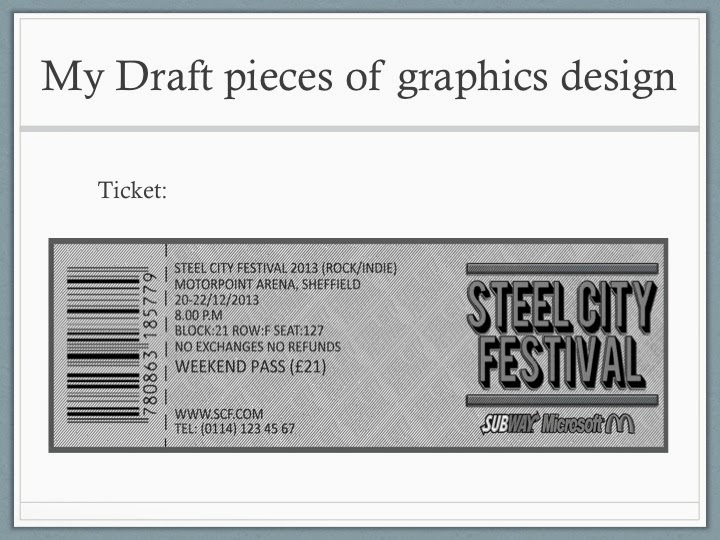
LO4: Task 4: KTA 13: Treatment for Steel City Fest Brief.
TREATMENT:
Budget - £1,982.08.
- Equipment –
Apple iMac £1,749.00.
- Software –
Adobe Photoshop £233.08.
What is the brief?
Our task was to choose the genres
for the Steel City Festival along with the types of artists and venues, and
create at least 3 pieces of graphics design, these were:
-
A logo (had
to be completed)
-
A magazine
advertisement for the event.
-
The official
A5 flyer for the event.
-
A billboard
poster.
Who is the audience?
People interested in the Steel
City Fest these could be fans of Indie/rock music preferably between the ages
of 18 and 30 because this is the age group that is most likely to attend the
festival and they are target audience.
Key dates for each milestone
Monday 18 – Tuesday 19 November
2013.
Health and safety considerations
Whilst on the iMac, I will not
eat or drink as food or liquid could damage the machine and could possibly lead
to malfunction.
Legal and ethical considerations
I will make sure I do not use
pictures from the internet and will draw/make my own images which I will use.
I will ensure that my works are
suitable and follow the code of practice for the Advertising Standards
Authority. Here are the rules:
• Adverts should not cause offence
•
Adverts should not
glorify alcohol, sexual activity or drug taking
•
Adverts should not
cause harm to children
•
Adverts should not
be misleading
Copyright
I will use my own images and
logos which I have drawn.
I will ensure I go into an agreement with Facebook and Twitter so I have permission to use their logos.
I will ensure I go into an agreement with Facebook and Twitter so I have permission to use their logos.
Saturday, 16 November 2013
LO3 Task 3: KTA 12: Analysis of Audience Feedback and Tutor Witness Statement.

The following results are results from the survey I have created in order to obtain feedback of my graphics design and my presentation.


These results matched my expectations. The instructions I received from the panel who judged my draft work, was to make the style of the work more suitable to the genre. On the billboard, the text which read "Steel City Fest" was uneasy to see as the colour of the text was similar to the colour of the background. The Steel City Fest logo was too simple, as it was just text. I will design a new logo that is more aesthetically pleasing than the draft logo. The feedback indicates that I must use a colour associated to the genre of Rock and Indie music as it would be more suitable and would create a brand identity. The feedback also indicates that I should use more images that are suitable to the genre.
Sunday, 10 November 2013


Saturday, 9 November 2013
Friday, 8 November 2013


Thursday, 7 November 2013

Monday, 4 November 2013

Subscribe to:
Posts (Atom)